KOPOD
A podcast website with a full-commitment 2000s old-school aesthetic — bold, loud, nostalgic, and unmistakably different from every other podcast site on the internet.
Web Design
Retro
2000s
Podcast
The Context
Podcasts are everywhere. Podcast websites look the same everywhere — clean cards, muted palettes, a "Subscribe on Spotify" button, and some waveform graphic that no one asked for. Safe. Predictable. Forgettable.
KOPOD didn't want forgettable.
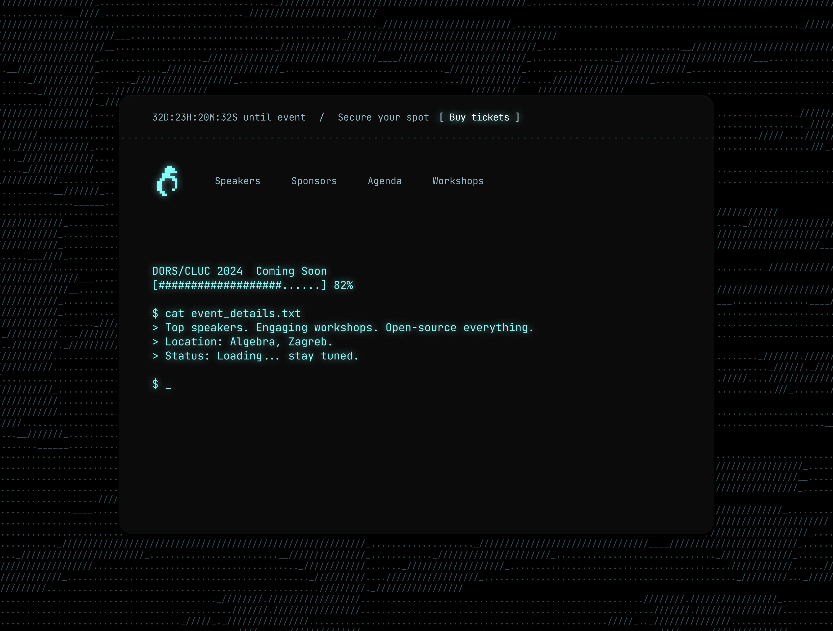
KOPOD arrived with a concept as clear as it was bold: build a podcast website that looks and feels like it was pulled straight out of the early 2000s internet. The kind of page that would've lived next to a Geocities site, a Flash intro, and a visitor counter that refreshed every thirty seconds. Not as a joke — but as a genuine aesthetic statement. A full commitment to the era.
In a space where everyone is trying to look modern, KOPOD chose to look gloriously old. And that took more craft than most people would expect.
The Brief
Design and build a podcast website with a 2000s old-school aesthetic — eye-catching, nostalgic, and distinctly not like anything else in the podcast space. The visual language should feel like a time capsule: bold, loud, layered, and unapologetically fun.
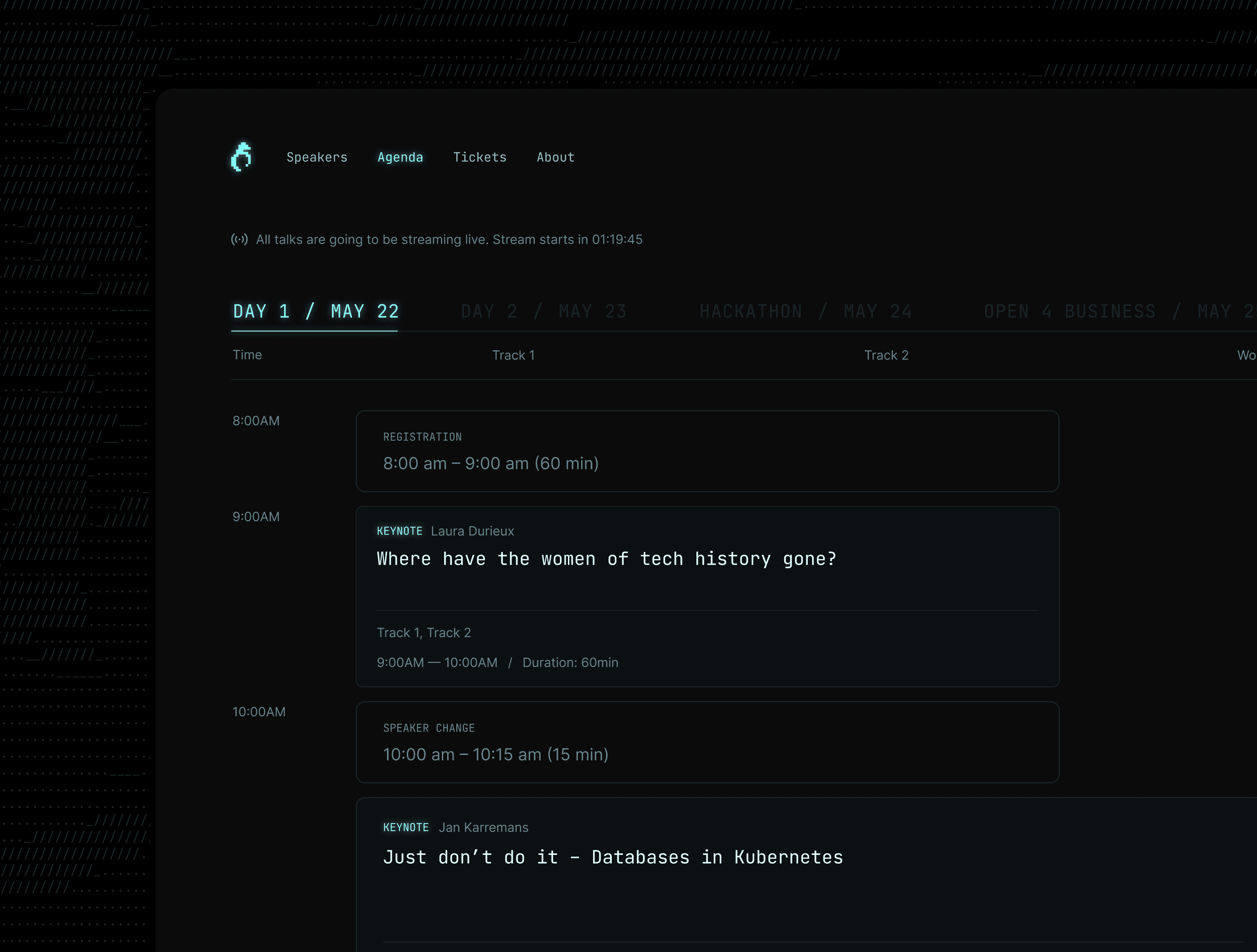
The site still needed to work as a functioning podcast platform — episode discovery, audio playback, show information — but wrapped in an aesthetic that made it an experience in itself.
The Challenge
Retro design is easy to do badly. Slap a pixelated border on a modern layout and add Comic Sans — done. That's not nostalgia, that's parody.
The challenge was designing something that felt genuinely of that era — the specific visual grammar of early 2000s web: tiled backgrounds, blinking elements, bold gradients, star and pixel motifs, table-based layout energy, hit counters, scrolling marquee text, neon colors on dark backgrounds — while still being functional enough for a real product with real listeners.
The balance was delicate. Lean too far into the chaos and the site becomes unusable. Lean too far into usability and the theme falls apart. Every design decision had to ask two questions simultaneously: does this feel 2000s? and can someone actually find the episode they're looking for?
Typography, color, layout, interaction — everything had to be curated with the same obsessive consistency you'd find in a well-executed period film set.
The Process
We started by going back to the source — studying the actual visual language of early 2000s web in detail. Not just remembering what it looked like, but understanding why it looked that way: the technical constraints, the design trends of the time, the typography available, the color theory (or lack thereof) of that era.
From that research, we extracted the elements that read as authentically 2000s without requiring a working knowledge of Netscape Navigator to navigate: the color palette (high contrast, neon, dark), the typeface attitude (bold, stacked, urgent), the texture use (scan lines, noise, gradients), the layout rhythm (dense, layered, rewarding to explore).
These became the building blocks of KOPOD's design system — a set of rules for how to be loud, visually rich, and consistently old-school without becoming visually incoherent.
Episode pages, the listening experience, navigation — each was given a 2000s treatment that maintained its function while fully committing to the character. Hover states had the right kind of janky charm. Section transitions felt like you were clicking through a GeoCities ring. The whole thing felt like opening a page you'd bookmarked in 2003 and somehow still worked.
The Outcome
KOPOD's website is unmistakable. In a space full of identical podcast pages, it's the one people screenshot and share before they've listened to a single episode. The aesthetic is the first impression, and the first impression is always memorable.
But what makes the project genuinely successful isn't the nostalgia alone — it's that the site works. Episodes are discoverable. The listening experience is functional. The content is front and center, even when the chrome around it is doing a lot.
KOPOD is proof that commitment to a concept — pursued with discipline and real craft — produces something that outlasts any trend. Because in a world obsessed with looking modern, looking old is the most original thing you can do.
KOPOD